
Jewel Tone Decor: Which Colors Count and How Much to Use
Jewel tones are the easiest palette to name and one of the harder ones to live with, because the thing that makes them work in a photograph is the thing that makes them exhausting in a room. Here is which colors actually qualify, how much of each to use, and what to put them against.
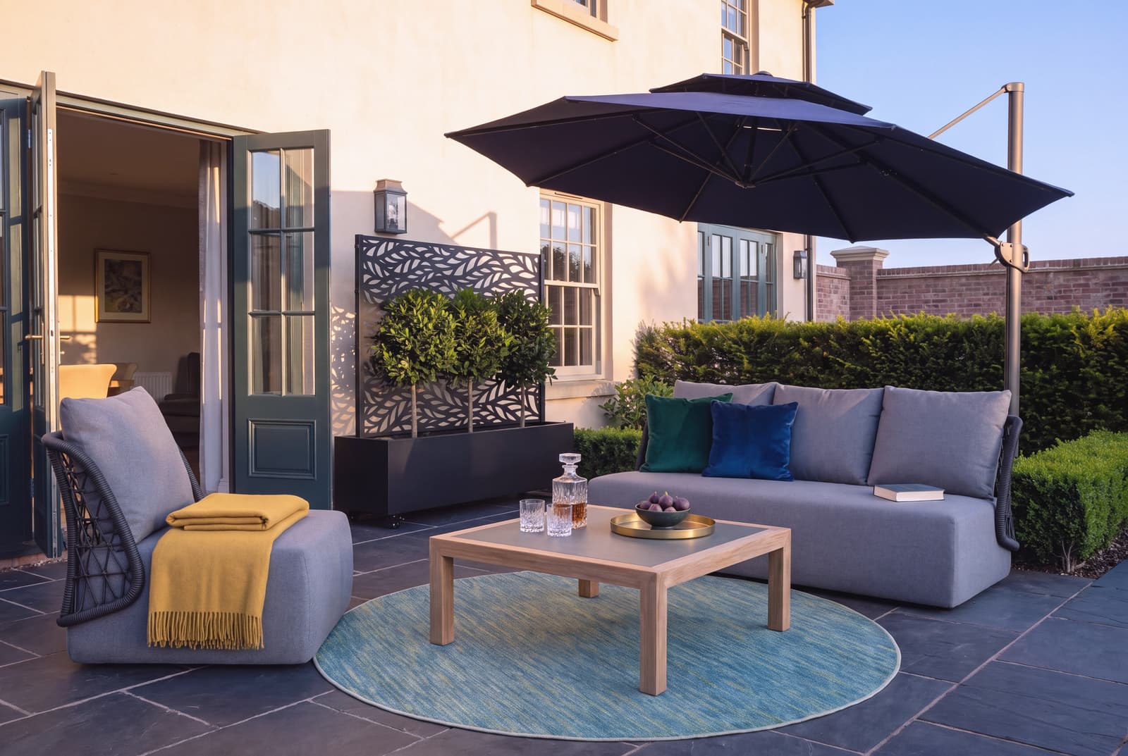
Hover or tap a dot to see what it is. See the full room, priced →
A jewel tone is a saturated color that stays dark when you desaturate it, and that one property explains everything else about how to use them. Emerald, sapphire, ruby, amethyst and topaz all read as rich rather than bright because they carry depth as well as intensity. Turquoise, coral and lime are equally saturated and do not qualify, because they go pale rather than dark when the color is drained out of them. That is the actual test, and it is worth knowing before you buy a sofa.
The practical consequence is that jewel tones behave like dark neutrals with a color attached. They ground a room the way charcoal or navy would, which is why they can carry far more visual weight than their brightness suggests, and why a room with three of them competing is tiring in a way a photograph of the same room is not.
The Colors, and Which Ones Do Not Count
The core five are emerald green, sapphire blue, ruby red, amethyst purple and topaz gold. Garnet, teal and ink blue sit comfortably alongside them. What they share is a dark value at full saturation.
The near misses matter more than the list, because they are what people reach for by mistake:
- Turquoise and aqua are bright rather than deep. They read as coastal or as a bathroom.
- Coral and hot pink are saturated but light in value. They read as a fashion palette rather than an interior one.
- Mustard and rust are deep but earthy rather than gem-like. They belong to mid century and to autumnal schemes, and they will fight an emerald rather than support it.
If you are uncertain about a color, photograph it and turn the photograph to black and white. A jewel tone will still be clearly darker than the wall behind it. That is the whole test.
How Much Is Too Much
This is where most jewel tone rooms come apart, and the answer is more specific than "use restraint".
Use one jewel tone as the room's color and treat every other one as an accent. An emerald sofa with a sapphire armchair, an amethyst rug and ruby cushions is not a jewel tone room, it is four rooms arguing. Pick the one that will occupy the most square footage, commit to it, and let the others appear in objects you could carry out under one arm.
Give them something quiet to sit against. Jewel tones need a neutral ground to read as rich rather than as loud. Warm white, oatmeal, greige, black, or natural wood. The ground is doing as much work as the color and it is the part people skip.
Weight them low. A dark saturated color at floor level reads as grounded. The same color on a ceiling or across every wall of a small room closes the space in. If you want a jewel tone on the walls, one wall or the room's lower half will nearly always look better than all four.
Jewel Tone Living Room
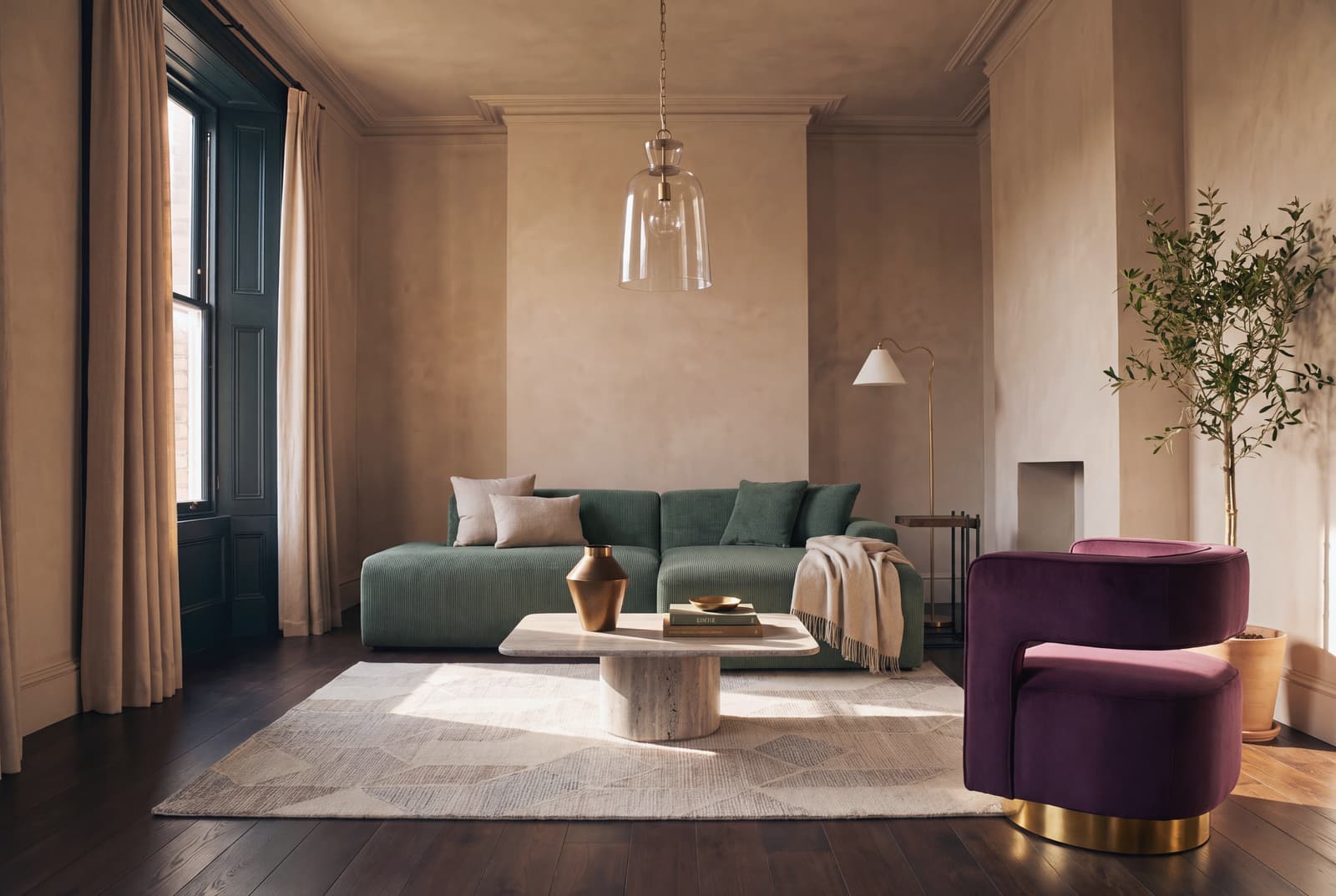
A velvet sofa in emerald, sapphire, or deep teal is the single most effective jewel tone purchase. Velvet is the right fabric because its pile catches light as it curves, showing three or four values of itself across one cushion. Ground the color on a natural jute rug paired with warm brass.
Jewel Tone Bedroom
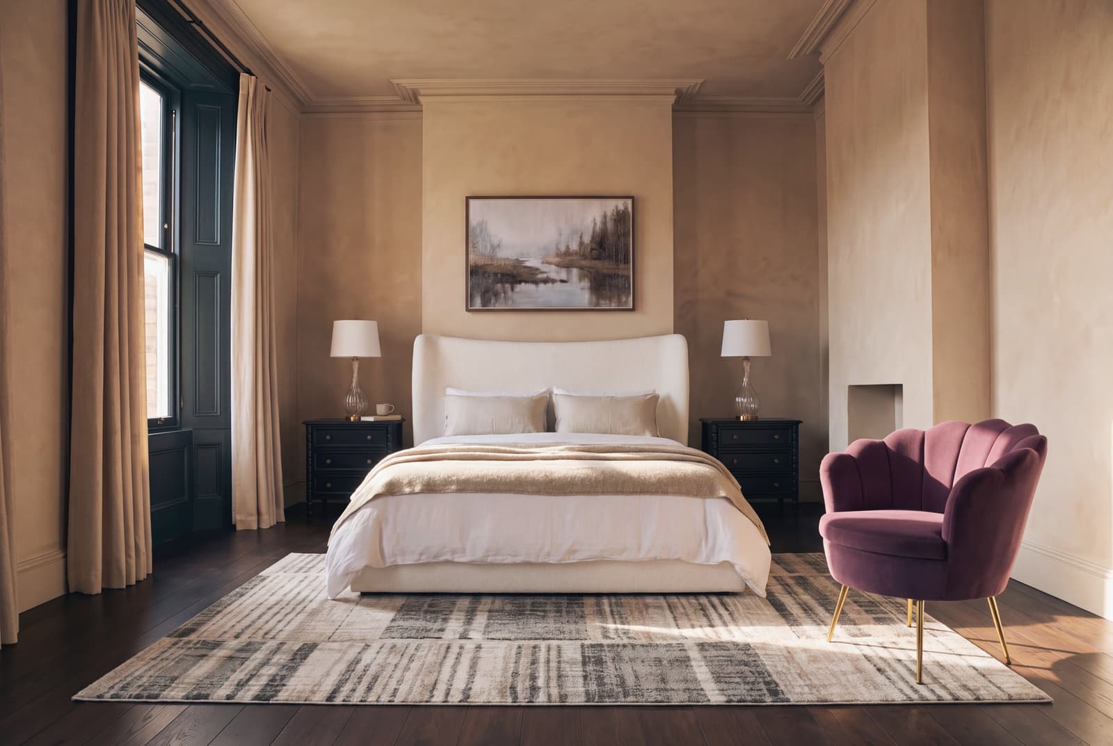
A bedroom takes jewel tones easily under lamplight, which is the light these colors were made for. The foolproof move is a velvet bed in emerald, sapphire, or plum against warm white walls and white linen. That creates one large piece of color with everything else remaining neutral.
Jewel Tone Dining Room
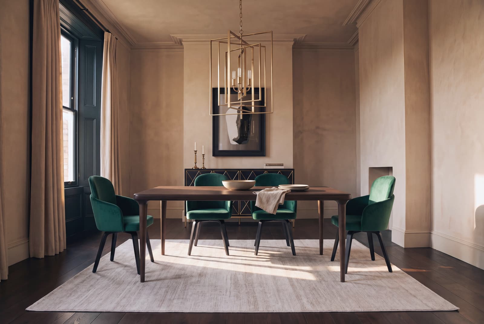
The dining room is the one place where the maximal version genuinely works. This is the room where you can put emerald on all four walls and be glad of it. Six chairs in one jewel tone around a plain table is a strong, cheap, reversible version of the whole idea.
Jewel Tone Home Office
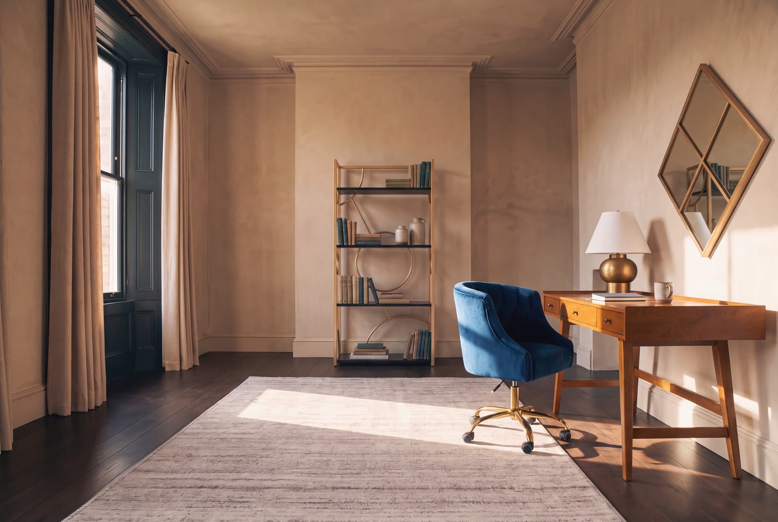
A desk chair in emerald or sapphire velvet turns an office into a room with an intention. Keep the desk itself plain wood to maintain a surface you can think over. Because the room has small surfaces, this single saturated piece does the most work for the least money.
Jewel Tones Against Pattern
Jewel tones and pattern can work together, but they compete for the same job, which is to hold the eye.
The safe version is pattern in a neutral, color in a solid. A geometric rug in oatmeal and cream under an emerald sofa gives you both without either fighting. The reverse, a patterned emerald sofa on a patterned rug, is the arrangement that reads as chaotic in a room and fine in a photograph, which is how most people end up with it.
If you want both at full strength, that is maximalist decor rather than this, and it is a different discipline: it works because the walls commit first and everything else answers them. Jewel tone works the opposite way, with a quiet shell and one loud object. Choosing which of the two you are doing, before buying anything, saves the most expensive mistake in either.
Metals, and Why Brass
Brass, unlacquered brass and antique gold all sit well with jewel tones because they are warm and slightly dulled. Polished chrome and bright nickel do not, because they are cool and hard, and against a saturated dark color they read as clinical.
Black metal is the other safe answer, and it is the better one if the room already leans dark. Mixing brass and black is fine. Mixing brass and chrome is the thing to avoid.
Buying Jewel Tone Furniture
What to look for:
- Velvet or a heavy weave rather than a flat synthetic, so the color has depth to show.
- A dark value at full saturation. Apply the black and white test before committing.
- Brass, antique gold or black legs and frames.
- One large piece rather than several medium ones. The palette rewards commitment on one item and restraint everywhere else.
What to avoid: bright turquoise sold as teal, jewel tone sets where sofa and chairs match, and anything in a shiny synthetic satin, which reads as a costume rather than a fabric.
Jewel Tones in a Rental or a Small Room
Jewel tones suit a small room better than most people expect, on the condition that you keep the color low and the walls light. A deep emerald sofa in a small pale room reads as considered. The same room with emerald walls reads as smaller.
In a rental, the entire palette is available without touching the walls, which is unusual. The sofa, the chairs, the rug, the cushions and the lighting are all portable, and jewel tones are one of the few looks that is essentially complete at furniture level.
If you can paint one thing, paint the inside of a bookcase or an alcove. It gives you a deep saturated field at a small scale, which is the most flattering way to see these colors, and it costs one tester pot.
Where to Start
Pick the one color. Buy the largest piece in it, in velvet if you can. Put it against a neutral. Add brass. Stop there for a month before adding a second jewel tone, because most rooms turn out not to need one.
If you would rather start from a finished room, we have put one together: a jewel tone living room with every piece in it listed and priced.
For the version of this with pattern and layering on top of the color, see maximalist decor, which uses the same palette and asks a great deal more of the walls.
See every room in the Jewel Tone hub.
Not sure where to start?
Quick choices between rooms, a few questions about your home, and a finished room for each room you want to furnish, every piece priced. A few minutes.
Start your home profile